I was reminded of this dreadful condition when I went to a production by an amateur theatre group the other day who obviously had lots of helpers. One of the helpers seemed fanatical about preparing computer generated signs. They were everywhere! They looked terrible and most stated the bleeding obvious!
I detest signs all over the place, particularly those stark computer generated signs plastered everywhere which really do nothing. They seem to imply that your customers, clients or patients are morons and need instructions about the bleeding obvious or that somebody in the organisation has nothing better to do.
So, have a look around your business premises through a visitor’s eyes, and, if you’re got lots of ugly signs all over the place, please do these things:
1. Ask are they really necessary and eliminate those that aren’t.
2. For the signs that are necessary choose the smallest number of words to make the message clear.
3. Have the signs prepared by somebody who has artistic and design sense (get a graphic artist or a signwriter) to make the sign do its job.
You’ll see what I mean about sign mania from these pictures taken at a motel where I stayed recently.


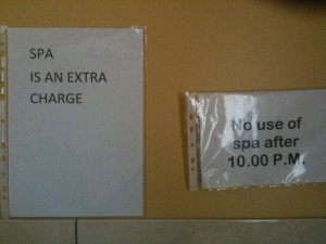
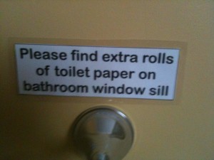
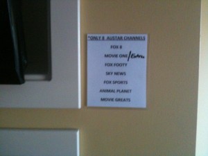
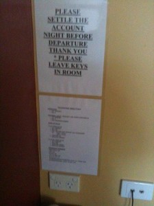

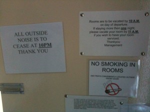
OMG – I think I’d have trouble sleeping at that motel. It would have to be the only one in town to make me go back there too!