Our guest contributor today is my miracle worker, Felicity Walker…
There comes a time in the life of any business when you need to freshen up your premises. But beware of falling into the trap of making changes for the sake of making changes, rather than changes that make life easier for your customer.
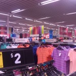
As a case in point, take a recent refresh of a large Kmart store. Although some people probably shop there quite frequently, most customers are likely to be fairly infrequent visitors. Which means that completely revamping the layout, while it may look great, is incredibly confusing if you don’t supply a map at the front of the store as an absolute minimum.
Signage can help alleviate this issue, and certainly there were some lovely big new signs in the store to identify departments. But the largely generic signs weren’t much help to a customer who remembers that greeting cards used to be next door to stationery, finally finds stationery in the “Home” department, then takes another 5 minutes to locate greeting cards near the “Kids” department on the other side of the store.
My personal favourite, though, was the signage for menswear. I had noticed signs saying “denim” and “underwear” on the back wall of the store. No indication who these particular items were for. In fact, the “mens” sign was on the last aisle, facing the back wall – and was only visible when you were already standing in the menswear department.
Okay, I hear you thinking, so the signs are a bit generic but at least they’re there, so your customer will work it out. But here’s where a change for the sake of change steps in – huge rack to ceiling graphic posters.
Yep, as well as higher racks, there are now banners everywhere that effectively block the customer’s view of the signs elsewhere in the store. So the few signs there are, mostly aren’t even visible until you’re quite close to that department.
Don’t even get me started on the idea of putting the main checkout area in the middle of the store, and just a few DIY checkouts next to the exit. You can probably already work out the result of that interesting change.
Now, it’s quite likely that you don’t have a business premises anywhere near the size of a Kmart, and maybe you don’t have customer premises at all, but don’t let that stop you from taking the time to REALLY think about what effect the changes you are making will have. Will your customers benefit? Will it make life easier for them? Or will they find themselves frustrated and annoyed, and deciding they’d rather shop somewhere else?
I know that Big W, located in the same shopping centre as the revamped Kmart, is looking mighty attractive right now.
As a footnote – I visited a different Kmart in another shopping centre over the weekend, with lots of specific signage and no big banners and racks blocking my view, and I had a much better customer experience!


Recent Comments