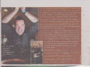
This advert was run by a local cafe recently. I do hope it worked for them but I suspect it didn’t produce the results they intended. It’s a while since I saw it so I don’t know how the cafe is doing but the advert could have been so much better. Let’s have a look at what could be done to improve it.
No headline-. The basic requirement for any exit is a great headline which flags down the market and gets them to read the rest of the ad. It’s all about that first ‘A’ in AIDA… the headline is what gets attention.
Having read the rest of their copy, I reckon, because of their claimed coffee making prowess, the headline should’ve been “Your first cup of coffee is free!”.
Terrible font- they may have thought that the font looked good but it’s so difficult to read for two reasons. First of all it’s been reversed out of white (that’s white print on a dark background). Secondly the font style itself may look lovely to the creative brain but the facts are it is hugely difficult to read. This breaches that prime rule of ‘make it easy’.
Too much copy-the copy in this advertisement goes on and on not only about the great coffee but how good they are and what else they do.
A good advert sticks to the subject and, in fact, the best approach is to write the headline and then tell the story of the headline, amplifying and explaining it so that the reader understands it.
So the body copy I would have written would have been along the lines of “Yes, that’s right! We are so proud of our coffee that we will give you your first cup of coffee absolutely free. We use the best single origin coffee beans that are fresh roasted to exactly the right temperature and ground to bring out their unbelievable flavour at exactly the right moment (which is just a minute or so before they are used to make your coffee). Then our gold award winning Barista makes your coffee exactly as you ordered it. And, by the way he knows what he is doing. He’s a champion and you’ll know it when you try his coffee. It’s so good you’ll almost want to drink it through your nose!
We know you will love our coffee so much you’ll keep on coming back. That’s why we want you to try your first cup for free. Simply say “I’m here for my free coffee” when you first come in and we’ll give you coffee with a smile that will make you smile.”
The story here is much shorter than the original which means they can use a small advert and run it more often. If I’ve got a choice I like to use small ads that work and repeat them frequently.
Not having a graphic (picture) to support the story- Whilst the photo may be a great one of someone, we know absolutely nothing about it and it has nothing to do with the story. There’s not even a caption to explain who it is.
If you’re talking about great coffee then surely the photo should be the best possible one of a beautiful cup of coffee? So good that the reader can almost sniff the aroma of the coffee from the page.
So that’s how I would have done it and I’m sure it would have worked gangbusters. By the way, getting them to ask for their free coffee means they can track how well the advert is working.
Oh, and by the way, wouldn’t they add on sell their “thick sliced toasted sourdough dripping with creamy butter and smothered in grandma Maria’s real homemade strawberry jam”?
So will they really be giving away free coffee? And, if it’s all as good as they promise, won’t customers keep on coming back? And won’t they go in the data base and join the loyalty club and, and…?


Winno, I tell you what, I learned a lot from your suggestions about this ad! And you’re right – an ad like this would lose me in a few seconds.
Is it the rise of DIY advertising which features, not actors, but managers and staff of the business that’s getting out of control?
Thanks for the tips Winno!
Lynn
The real problem is that people write their own adverts when they should find an expert to do it for them. It may cost a lot (for example I charge around $550 dependent on advert size) but if they use it regularly and it brings in the business its not a cost but an investment.