Occasionally I’ll spend some time talking about the good, the brave and the ugly when it comes to outdoor advertising signs. In other words some signage that makes sense and some that doesn’t. I’m often reminded of a sign I saw many years ago, lovingly erected by a municipal authority that simply read “Do not throw stones at this notice.” Nothing else, just that! Maybe once it had borne another message that no longer applied and they didn’t want to waste a sign that had already been erected. Who knows?
Here’s a sign that riles me. It’s a large sign at a suburban mall and would have cost a motza.
It’s what I call a “who cares, so what?” type of sign. When you’ve read it what are you s’posed to do as a result? In any event who do they want to read it and wouldn’t there be a better way to reach whoever they do want than just blast it in a big shopping centre car park?
I could go on but I think you’ll see my point!
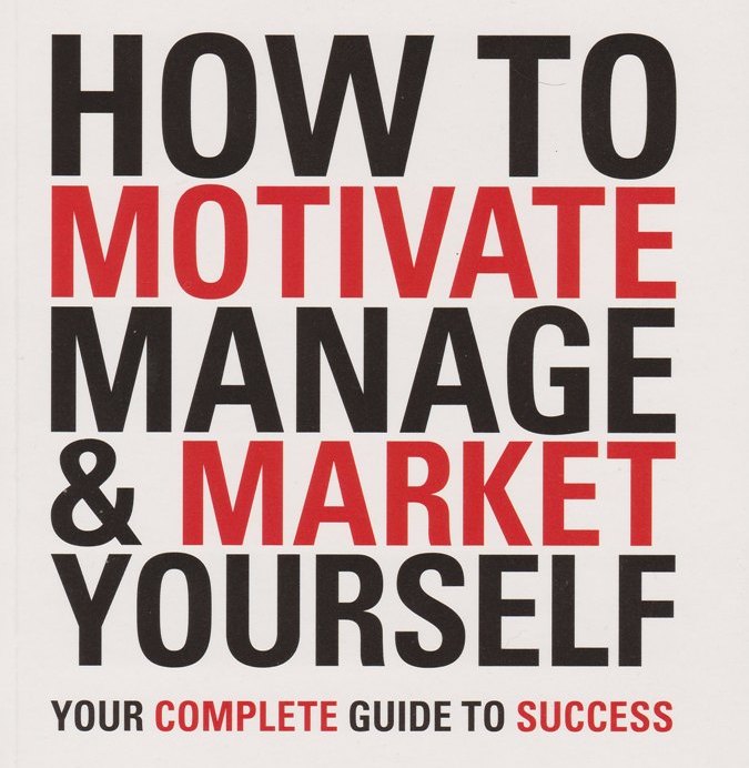
 If you want to do more, be more and achieve more you must start reading this book today. It’s for those who want to live fully and achieve both their personal and business goals in life. This is a compelling book filled with simple practical ideas you can implement immediately. Get it here.


It drives me crazy the number of huge(expensive) outdoor advertising signs that have too much writing or don’t make it clear what product they are promoting especially when I am going past at 60kph. What is wrong with these advertising people.