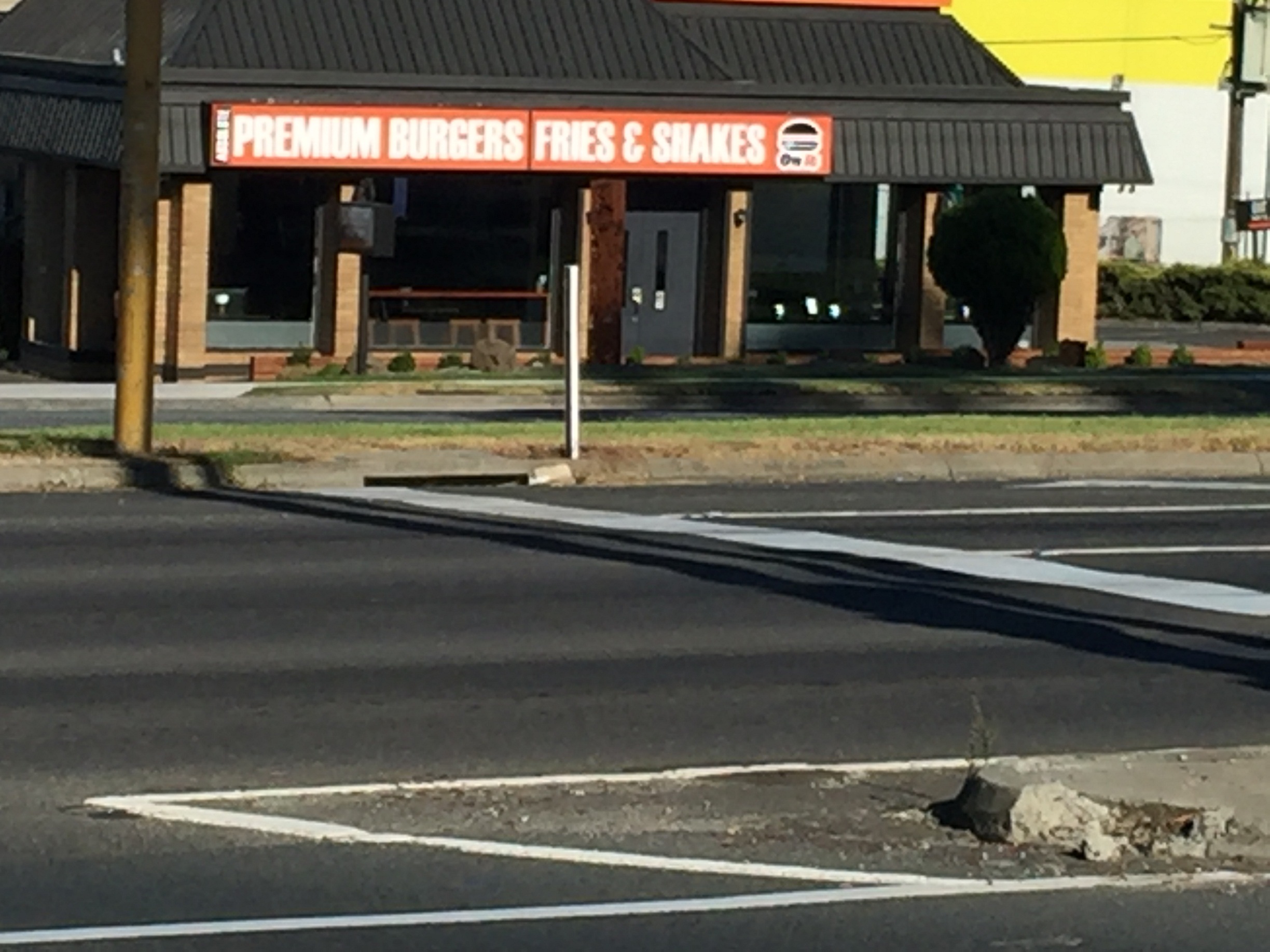
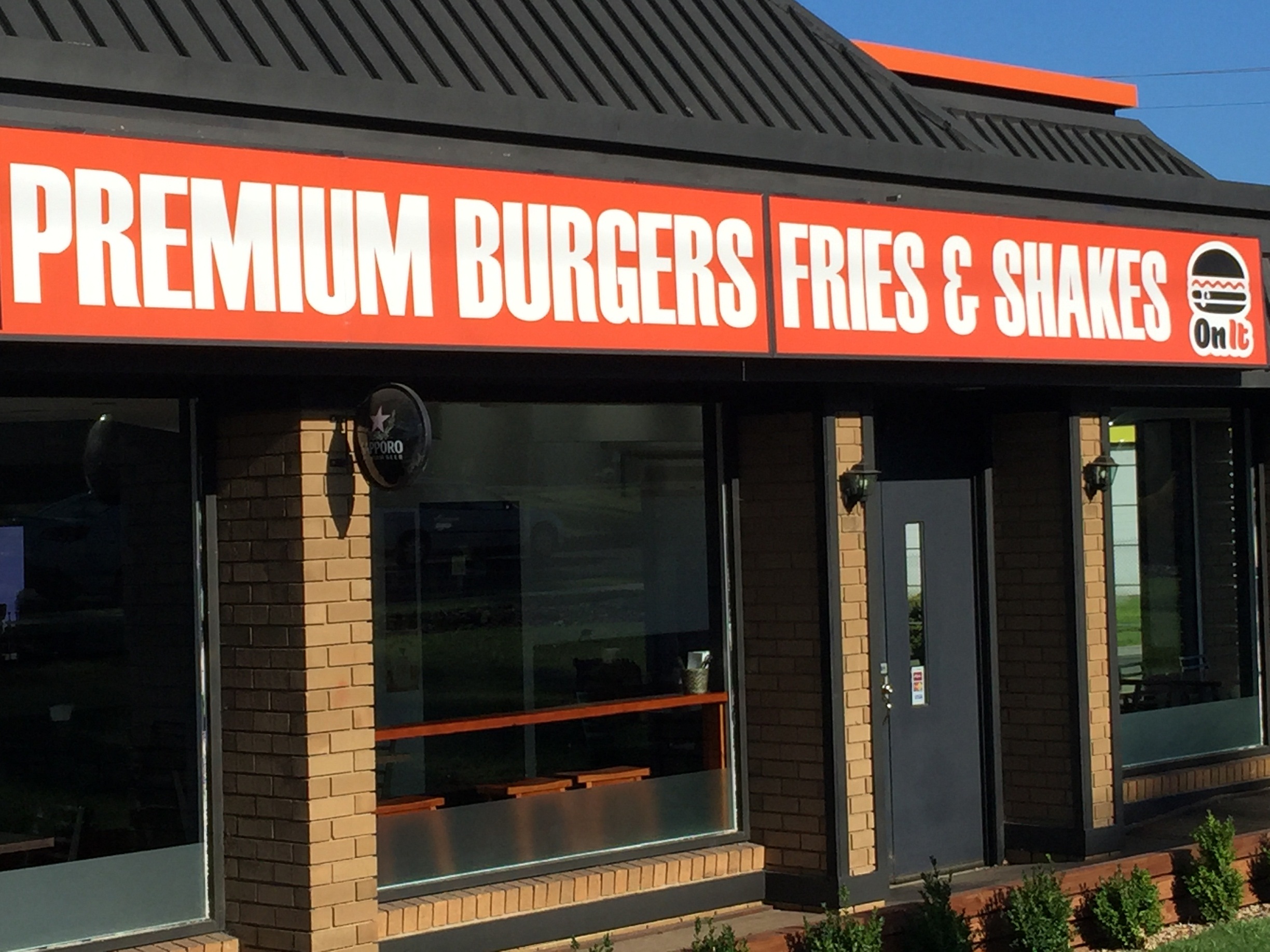
Driving home on Sunday morning after walking with my mates and dogs and I pulled up at traffic lights at a tee intersection. Right opposite me was a building with a great big sign in a perfect position for people waiting in cars at the lights with lots of time to read it. The only trouble was it almost impossible to read. It was all in capital letters which are darned hard to read at the best of times and more over it was light letters on a dark background.

Of course, as I drove off, turning to the right and going past I could read what the sign said but, by then, it was too late… I was past it. Had the sign been more readable from where I was pulled up at the lights I would have been perfectly positioned to have pulled in and maybe tried their burgers (although I must admit it was a bit too early on a Sunday!).

What’s the point of this story for us? Always survey the area around your building where you intend to mount your signs to decide where the best possible position will be so they will be seen by the most passing traffic (or pedestrians if that’s who you are targeting).
Then ensure the sign font and colours are the best possible to attract maximum attention and readers. The better the sign the more people will view it and (providing you’ve got the right message to attract the right viewers) the more your sales.
Invest $40 and turn your business into a money machine!
Discover the 3 black boxes to get your business really firing!
Get them working for you and start making the money to prematurely retire to the beaches of the world while you are still young and fit enough to enjoy it.

I know of a chicken shop that sells wonderful chicken deals..
The butcher has his sign proudly displayed above the the top of the windows in bold capital letters which is in two separate part sections and like any good retailer it reads;
……………….
processed chemically
free chickens
………………….
On a Saturday morning when we did our weekly shop, I went inside and asked for 2 of his free chickens and he looked at me rather strange..
I asked again for 2 of his free chickens and he just quietly asked me to leave..
I simply said that he was a bit lousy as he advertised free chickens above his window, I told him that I did not care about how they were processed and that most chicken meat is bleached anyway when processed..
I just wanted 3 free chickens to go..
When he came around the corner to move me out of his shop, I asked him to come and look at his sign as it clearly showed he had free chickens..
He came outside and looked up and said, you idiot, that is to say we do not process our chickens with chemicals..
I suggested that people can be a little simple with their reading so he needs to consider the impact and maybe change it to say “Our chickens are processed chemically free” and describe what the feature or benefit is but don’t scrimp on the words.
PS: The sign is still the same..