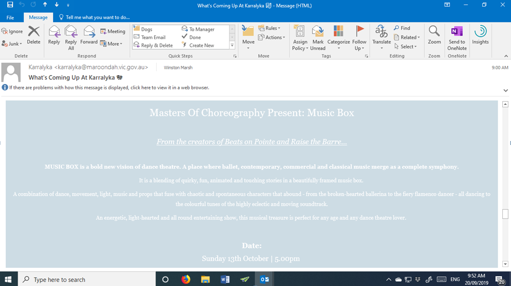
I’d love to tell you what this is all about but I can’t because I can’t read it… and it’s not because of the size of the image. It’s because they’ve chosen to print their message in a white font.
There was a hyperlink in a pretty bland email I received and, as I recall, the hyperlink was for me to “View our offer here!” Stupid, stupid, stupid!
Don’t you think someone could have checked the email and link to see how the image came up and would be viewed by recipients?
It’s a great practice to follow.

And whilst I’m on this sort of irritant don’t get me started about people who have websites or e-mails printed a very light grey font that is very difficult to read… so I don’t.
Grrr, as I said don’t get me started!
Work less, charge more and have your customers loving it!
Marketing Magic

Recent Comments