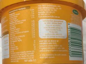
One of the creative tricks graphic artists like to use coz it looks great and wins prizes is what we call “reversing the print out of white”. It’s where the print appears to be in white ink but what really is done is that they print the black (or a dark colour) background and the white (or lighter colour) is ‘knocked out’ of it or shines through.

It looks great but unless it’s a really big print font it reduces reader comprehension. Advertising guru, David Ogilvy, said that advertising copy should never be set in reverse type. I reckon it should be kept for big headlines and not used anywhere else in your copy.
See how difficult it is to read the text in the image above. Of course, if you blow it up it becomes easier, but in the typical small font used for body copy it’s almost impossible to read (and, the older the reader, the more difficult it becomes!).
Winston's guru Dan Kennedy often says be a better marketer of what you do, than doer of what you do, and unfortunately, most people aren't. Learn the marketing basics for your business now! Marketing Magic

Damn straight, Winno! This is one of the top copywriting commandments I give to every client who’ll listen. So nice to hear we’re on the same page. Kind regards, P. 🙂
Being on the same page as you makes me feel I’m on the right tram! Oops am I mixing metaphors?
Have a f-a-n-t-a-s-t-i-c day… Winno