You’ll see money being wasted on advertising all over the place and one factor you should always consider is whether it will get the attention of the target market.
Now of course the headline in print copy is always of utmost importance, but ahead of that is the question of “will they see it”? Is the advertisement of the size, colour, location that will draw their eye to it before they even see the headline?
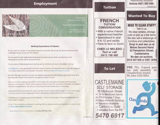
Here’s a case in point from a regional local paper, drawn to my attention by a good friend (and master spectacle maker, which may have something to do with it) Bruce Dudon.

It’s the greenish 2 column advert on the left to which I refer and compare it with the single (much smaller size and cost) adverts to the right of it. (And, by the way, if you’re viewing this on your PC or laptop, the image will be pretty close to actual size.)
Which gets your attention and gets a message across?
Download Winston’s fantastic “How to write a great advertisement” for just $40 here
As Bruce says, “I found this advert “Seeking Expressions of Interest” but, if you compare it with the other adverts on the page, it has been run by an organisation not really wanting your interest or mine.”
If you don’t get their attention your money is absolutely wasted. Worth remembering!

Recent Comments