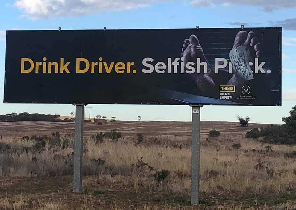
Every time I drive along a freeway, I keep my eyes skinned, (whilst not losing driver concentration of course), to see who has been wasting money on billboard advertising. By wasting money I mean billboards that have too much detail to take in as you whizz past or are just plainly incomprehensible. Neither do a great job of getting the message across.
Work less, charge more and have your customers loving it!
Marketing Magic

I like to see a short (maybe up to 12 words) “headline” that gets the message across, with a great graphic (picture) that supports the message and lodges it firmly in the mind. Like, bang, it’s there, you’ve got it and you don’t have to think about it… and you’ll remember it!
Here’s one that does a pretty good job although I think they could have spelt “prick” right out without offending too many sensibilities. After all, I reckon that’s the phrase we all use!

Recent Comments