I have often written about external signage and that you must remember to make it stand out because I don’t see the value of having signs that blend into the background like so many do!
For example, medical and veterinary practices love having signs that feature white letters on a blue background. That’s coz they are the most calming colours and so give you a sense of what their care will presumably give you. Only trouble is they don’t stand out from the crowded background or seize your attention. The way to do it is generally to have dark letters on a light background… or at least strong vibrant colours that contrast well.
So, one of my suggestions has been to learn from a couple of the world’s biggest and most successful companies and steal their colours for your signs. And who are they? Why, McDonalds and Shell of course! And what colours do they use? Red and yellow which stand out like, well, you know, the proverbial.
A sign that read “Crook people (or dogs) fixed here!” in red on yellow (or even vice versa) would certainly pull attention and prospects!
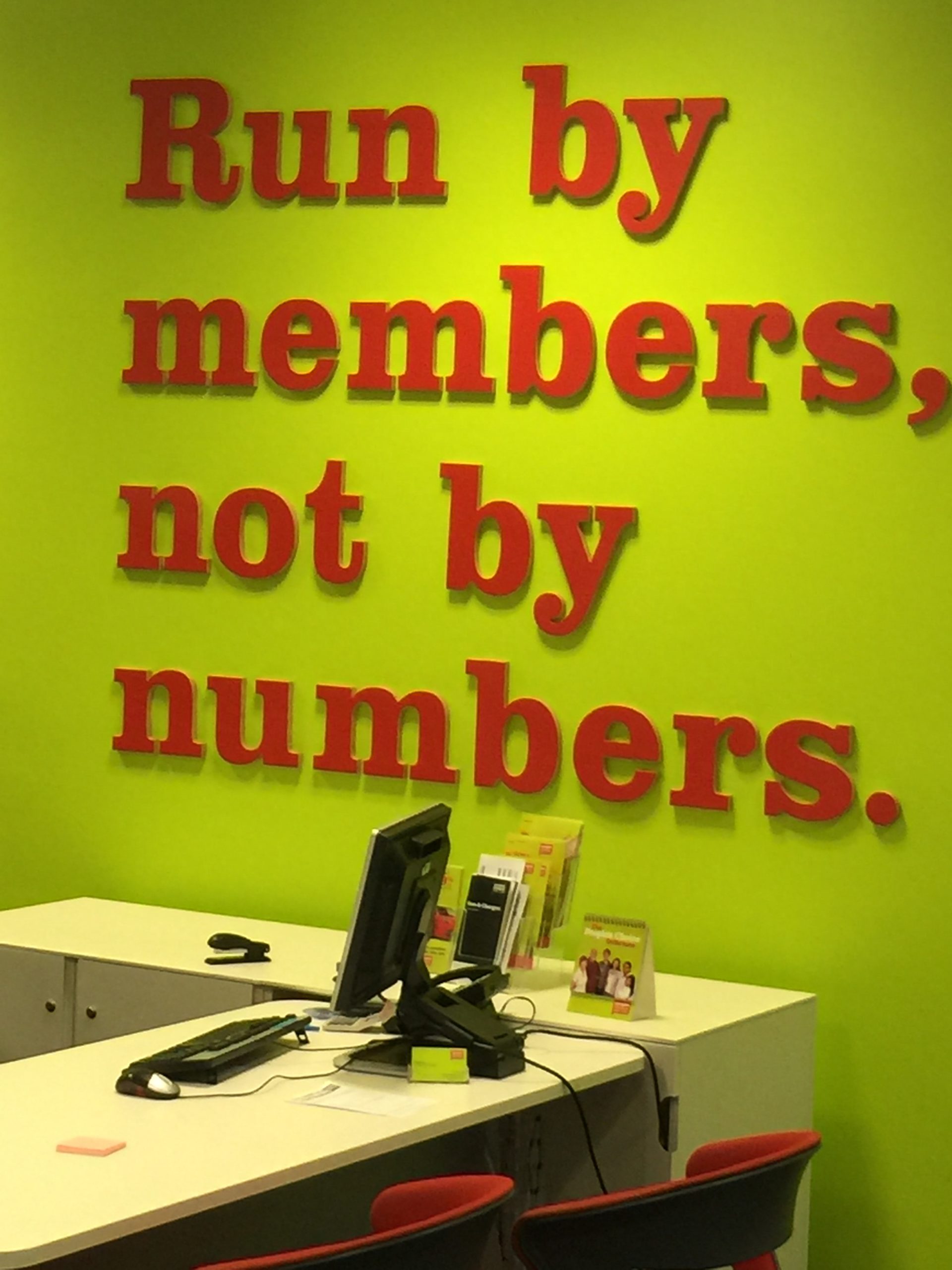
Walking through a local shopping centre yesterday I saw a sign in a Credit Union that demonstrated the power of great colour usage… and it wasn’t even my favourite red and yellow! But it worked a treat as this photo shows.
The lesson: If you have signs that don’t stand out nobody will find you! And, by the way, don’t worry what your competitors may think… they don’t pay your supermarket bill!
Practical advice and solutions expressed clearly and concisely.
Pick Winno's brain.


Recent Comments