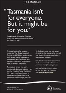
One of the things that art directors love to do is what is called “reversing out of white”. The advertisement on the left is a classic example of the technique which means that the words appear to be printed in white ink whereas, in reality, the words have been formed by the areas where black ink has not be applied. The arty people love it because it looks so good and often wins awards… for looking good!


Now unfortunately, although I must admit it does look good, marketing people who want results by getting buyers through the doors hate it because it’s only good for large font sizes, headlines and the like. The smaller the font the more difficult it is to read as this example so adequately demonstrates.
And the arty people get positively orgasmic when they can reverse out of a colour, as in this case out of blue, coz it does make for very pretty images.
But, it doesn’t alter the fact that it gets darn hard to read!
So please, remember reversing ain’t a good idea. At least that’s if you want your missives read and the results to roll in!
These clippings from the May 7 issue of The Age Digital Edition Copyright © 2022 The Age. To subscribe, visit https://www.theage.com.au

Light grey type on a white backgroumd, anoter favourite of art directors, also looks nice but is hard to read
Agree wholeheartedly Malcolm and the current fad for using a light grey font on a white background emails is one that’s very annoying too!
Have a f-a-n-t-a-s-t-i-c day… Winno