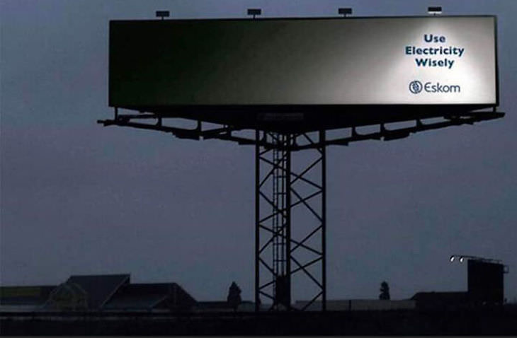
Years ago when I was looking into the use of billboards for a client, I rapidly realised there were a couple of cardinal rules. The message:
1. Had to be simple, easily understood!
2. Used a minimum number of words to make the point.
3. Used a great graphic if it rammed the message home.
Here are a few that illustrate what I’m talking about (and doesn’t the first sign really deliver a message we rarely think about?). The last one is a bit pointless but I love it!


Recent Comments